Web Accessibility

Web accessibility refers to the common practice of designing and developing websites in such a way that it eliminate difficulties for people with disabilities from accessing information and functionality of the web.

The Web is an important source of information in many aspects of life, be it education, health care, government, commence, recreation and more. It is necessary that the web be made accessible to everyone including people with disabilities so as to provide equal opportunity. It also help people with disabilities  stay connected and relevant to the society.

Another importance of web accessibility for organizations is that it is required by laws and policies in some cases.

This video shows us how web accessibility can be an important social factor in our current society where the web is something we cannot live without.

Video Link: https://www.youtube.com/watch?v=BEFgnYktC7U


Web accessibility aims to address the needs in different areas including:

  • Visual – people who are color blind, or have visual impairments such as low vision
  • Mobility – people who have difficulty moving their hands which in case hinder their control over the mouse cursor
  • Auditory – people who have difficulty hearing to audio instructions
  • Seizures – people who have photo epileptic seizures caused by visual strobe or flashing effects
  • Intellectual – people who have developmental and learning disabilities such as dyslexia

Making a web site accessible can be simple or complex, as it depend on many factors such as the target audience, type of content, size and complexity of the site, software tools and environment are also in consideration.

There are many guidelines and techniques available on the web including many different assistive technologies to help people with disabilities.

Assistive technologies include:

A web-based on screen keyboard

The keyboard is web based therefore allowing users to access it even without installing it on the computer.

An oversized trackball mouse


People with tremors in hands will find this mouse relatively easy to use than the standard mouse.


Techniques for better Web Accessibility

There are many different techniques used to provide better web accessibility.

For example,

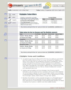
Before                                           After

web access2 web access1


  1. The Headline is marked up using HTML header <h1> tag.
  2. The table headers has also been marked up using various HTML element such as, <th scope> and <caption>.
  3. Using the structured content to convey semantic meaning when text is emphasized using <strong> element.
  4. Phone number is also emphasized and provided as text rather than image, it is  also provided in both number and text format
  5. Table data has been structured and associated with the headers using id and summary attributes
  6. Seat options are spell out in full to avoid acronyms
  7. Provide sufficient color contrast between the background and the content to increase readability
  8. Text is marked up semantically to emphasize on important content and easier to read. Bolding, italics, underlining and other text decorations are used when necessary

Evaluating web accessibility of a web site

When designing and developing a web site it is always better to evaluate before and throughout the development process so as to identify accessibility problems early and able to address them as soon as possible. Simple techniques such as changing settings and colors can means a whole lot of differences to other people.

There are many web accessibility evaluation tools available on the net such as the tools listed in this web page: http://www.w3.org/WAI/ER/tools/

Overlapping with Mobile access

Most of the people owns a computer or laptop but some people only has access to their phones to surf the net therefore certain web pages design and accessibility have to overlap to accommodate mobile browsers.

Conclusion

Web accessibility does not only benefit people with disabilities but also benefit older generations, people with low bandwidth connections or user older technologies, new and infrequent users and also people with low literacy or not fluent in the language.

References

http://www.w3.org/WAI/

https://en.wikipedia.org/wiki/Web_accessibility

http://www.w3.org/WAI/demos/bad/Overview.html

http://webaim.org/intro/


User Experience Design

UX

What is UX Design?

UX design, only known as user experience design, is a process of improving user satisfaction.

This can be done through improving the usability, accessibility, and pleasure provided during the interaction between the user and the product.

UX designers study and evaluate how users feel about a system, and work to improve aspects that users may be dissatisfied with.

This includes aspects such as ease of use, perception of the value of the system, and efficiency of performing tasks.

So why is UX important?

User experience is just as important as visual identity. A good UX design allows a user to interact with an interface intuitively.

This allows them to enjoy the interaction with the interface more.

UX is especially important for complex websites. Having a good UX design helps the end user easily navigate the complex website.

Basically, UX design is to make the user feel good when they interact with the product. Whether the product is a website, or an app.

Personally, I feel that UX design is especially important for mobile apps.

In such a saturated market, where anyone can create an app. An app with really good UX design would stand out from its’ competitors.

A good design would also keep users coming back to the app, as well as make it more convenient for the users to use.

What makes an app’s design bad?

Some things to avoid while creating an app would be, creating badly sized buttons, poor content prioritization, and lack of a universal navigation.

Badly Sized buttons would cause difficulty for the end user to do what they need to do with the app. This slows down the process for the user to do what they need to do.

Poor content prioritization would cause the user to be overloaded with irrelevant content. The design should focus on the most important information that the user needs to know.

The lack of a universal navigation makes it troublesome for the user to get to certain functions. A universal navigation helps the user get to any function of the app they want.

Summary

UX design is important throughout the design and implementation phase of an interface.

It focuses on the experience of the user while they are interacting with the interface.

The interface should be designed to be as intuitive as possible. The interface should guide the user to do what they want/need to do.

This is especially important for mobile applications, to keep the users using the app.


Elements of UXD

Websites and Web applications have become more and more complex these days thus user experience is essential in the development of websites. It is important to provide rich interactive experiences as it ensure users’ satisfaction when they are using the websites.

Screen Shot 2015-09-16 at 8.29.21 pm

However, it is not easy to create a great user experience. Other than design, UXD also includes information architecture, visual design, usability, interaction design, prototype development and user research which are some of the important elements of UXD as shown in the image above. In this post, I will discuss and give examples on information architecture, usability and interaction design.

1. Information Architecture

“How does a user find the information they want?”

Information architecture focuses on the organization and structure of information in which a user can navigate through. Website structure should be created in a way that users are able to complete their tasks efficiently.

Screen Shot 2015-09-16 at 9.05.50 pm

(http://www.arngren.net)

Firstly, as seen in above example, it is unorganized in term of content. Furthermore, it does not have any structure, which make it looks very messy and confusing. Inconsistent information layouts such as image size can lead to bad user experience and cause the users to leave the website.

Next, the hyper links is not obvious from the content. Users might not know whether that is a link or where will they reach upon clicking. Last but not least, the goal of the website is not clear too, users do not know whether the site is selling products or advertising.

2. Usability

“How easily users can complete intended tasks?”

A good website can be determine by the usability it can provides to the end users. It should allow users to achieve their goal with the use of the website.

1

 (http://www.google.com)

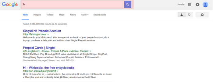
As we know Google is a search engine where users search for information. Thus, the placement of the search box is very important. In this case, it is placed consistently at the top of the website which make it visible to users. They do not have to find it whenever they are directed to the other pages.

2

(www.ntulearn.ntu.edu.sg)

It is also important to have many ways to access some of the information on the website. As shown in the image above, users not only can read the slides directly from the website, they are also able to download the slides to their computer for later use.

3

(https://www.cycling74.com)

Lastly, the content should be readable as users only scan for information in the websites. To enhance the experience, it should be organized in the way that users can read with ease. As shown in the example above, users can click to expand and retract the information and are able to copy the information to the clipboard. The codes are hide from the users and only appear when they click it. It does not only looks neater; users do not have to scroll all the way down to copy the codes too.

3. Interaction Design 

“How does a user take the action they want?”

Interaction design is related to the structure and behavior of interactive systems. It focused on users’ behaviours and actions during a user flow of an interface.

4

(http://www.adidasdesignstudios.com)

In the above example, it has consistent navigation menu, behaviour and readable typographic across the website.

Users are also able to see the interaction opportunities within the website. For example, the play button on the hero element tells the users that it is a video. The drop-down main navigation menu comes with a short description below every links give clues to the users about where it will lead them to upon clicking.

5

(http://usabilitygeek.com/tag/usability-2/)

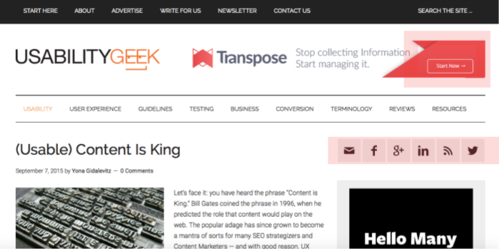
The example above has clear icon such as ‘start now’ button at the hero element and recognizable social media icons such as Facebook, Twitter etc.

6

(http://www.apple.com)

Interface behavior such like sliders, mouse over actions or even drag and drop are also taken into consideration as they helps to interact with the users.

In conclusion, the common factor in all UXD elements is consistency. It plays a significant part in enhancing user experience and a good UXD definitely increases traffic to the websites. Nevertheless, a good UXD can reduces costs on development, maintenance and support.

References:

“5 vital elements of a good User Experience Design,” last modified September 25, 2013, http://www.netsolutionsindia.com/blog/5-vital-elements-of-a-good-user-experience-design/

“The web information architecture and interaction design,” last modified May 15 2008, http://www.cooper.com/journal/2005/09/the_web_information_architectu

User Flow & Onboarding

A good user flow not only provides a positive experience for users interacting with the site, but maximize conversions from a business standpoint as well. An example of conversions would be, from a visitor to a subscriber to a buyer. That is where User Onboarding comes in. User Onboarding is the process of increasing the likelihood of users becoming successful in adopting your product or service. In other words, achieving your business objective.

Understanding each user and business objectives allows us to create a positive user experience as well as a valuable one from a business standpoint. Having a detailed understanding of the objectives of both user and the business, enable us to design various flows that are needed to achieve both parties’ goals.

Users can come from different sources, so deciding where to focus is important in order to impact the most users and have the greatest gain. When the user hits the landing page, the real user flow work really begins. The flow should fill in the gaps of information by providing the user with the data that they need to be converted.

A relatively good example would be Gmail’s landing page. Here, the landing page provides the user with the data they need. In this case, the user objective would be to create an email account. The consistent styles for the primary call to action buttons appeals directly to the user’s objective.

screenshot-www.gmail.com 2015-09-18 01-21-41

By listing the key benefits of Gmail in an easy-to-understand way, it builds the user’s confidence in the service they provide. The placement of the hook is a good call to direct users to the CTA button and move on to the registration page.

Upon clicking the CTA button, it straight away brings the user to the registration page with all the fields that are required to be filled up.

gmail sign up

Another relatively good example of user flow would be WordPress. The CTA buttons is presented clearly and appeals directly to the user’s objective. A clean layout with an aesthetically appealing background that relates to the theme, or rather, the objective that the user has for his/her website/blog.

wordpress

The choice of words used in the hook, for example “free”, entices the user to proceed on. Clicking on either CTA button, brings the user to the next page.wordpress create website

WordPress removes friction at every step in helping user fulfill their objectives by asking for minimal amount of information at a time. Utilizing a single field & a CTA button, reduces clutter & complications the user might have.

wordpress choose theme

Providing a clear and direct flow for users to achieve their objective every step of the way.

This article on smashingmagazine.com, provides more insight to how spending more time on designing user flows would be beneficial than focusing too much on page design.

screenshot-www.smashingmagazine.com 2015-09-18 01-19-13

To have a look at how some websites oboards new users, check out this site. It provides a teardown on how some websites onboards new users in a casual and informative way.

useronboarding

References:

https://www.gmail.com/intl/en/mail/help/about.html
https://wordpress.com/

http://www.smashingmagazine.com/2012/01/stop-designing-pages-start-designing-flows/

http://www.useronboard.com/

Grid Theory

The role of design is to communicate. Many web designers find grid is a useful tool to organize space and distribute information to create clarity, efficiency, economy and continuity during communication.
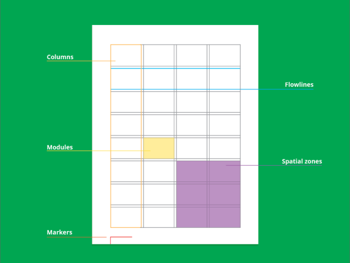
“A grid consists of a distinct set of alignment-based relationships that act as guides for distributing elements across a format.”[1] An anatomy of the grid is as follows:

1

Depending on different informational needs, we can address different design problems based on the following 4 types of grid structures:

  1. Manuscript Grid:

2

This type is derived from traditional manuscript/printing style and is suitable for arranging large volume of text with the simplest layout. It’s defined by a main text body, margins and additional information shown in the header/footer area.

Margin plays an important role in such a simple layout. “In general, wider margins help focus the eye and create a sense of calm or stability.”[2] Variation in margin can also introduce visual interest to engage the reader more when facing such heavy readings. The size, leading, spacing and other characteristics of the text are also essential in enhancing the readability and overall hierarchy of the page.

The following example shows a manuscript grid layout .The line spacing variation helps to distinguish the quotes from the rest. Big margins on both sides direct reader’s eyes to the information, create spaces for rest and define the width of the text line. Although same typeface (Georgia) is used for the whole page, colors and sizes help to group different information. Important links are emphasized by the orange highlights.

screenshot-andyrutledge.com 2015-09-11 20-30-10

http://andyrutledge.com/the-designer-designs.php

  1. Column Grid

3Column grid is useful in organizing discontinuous or independent information with higher flexibility. The most essential consideration for this layout design is the column width, which is highly dependent on the content length and type characteristics. Short width may help fast scanning, but it may introduce excessive hyphenation and uneven rag around the edge. However, too wide columns can create difficulty in finding the beginnings of sequential lines. Driven the nature of the information, columns can be combined to form a compound column grid structure.

The following example divides the page into 4 columns with uneven width. Thus it’s a compound column grid structure which arranges different information with different emphasis. The middle part consisting of 2 columns is the main content while the two columns at the sides are for externals links like advertising and social media.

screenshot-www.reference.com 2015-09-11 21-05-08

http://www.reference.com/

  1. Modular Grid

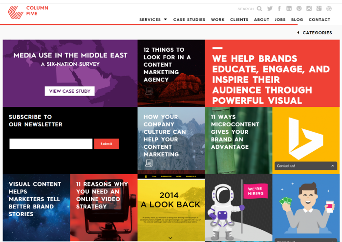
4Extremely complex information can be organized by modular grid structure which consists of a matrix of cells called modules. Neighboring Modules can be grouped as spatial zones to handle different types of information like images. Smaller subdivision brings more degree of control and precision, while too many modules can become messy and redundant. With its interrelationship and flexibility, we can design the format simultaneously and thus increase efficiency. Aesthetics wise, this structure adds visual interests and makes even simple information look more ordered, clear and modern. Additionally, tabular information like charts, tables and schedules can be integrated harmoniously by making use of the standardized subspaces.

The following example uses the cells of the modular grid as entry points to subpages. This kind of navigation is clear and organized. Information with the same level of importance occupies the same area. Different contents are made uniformed and consistent.

screenshot-www.columnfivemedia.com 2015-09-11 21-13-13http://www.columnfivemedia.com/

  1. Hierarchical Grid

5

The last type of grid depends on the informational needs the most. Column widths and intervals between them tend to vary. With the variation of the display environment, this organic structure is widely used for web pages as it can be customized to different arrangements while still holding all parts together.

The following example shows a hierarchical structure. The top large banner is the login area. The following columns and rows contain various text, images and thumbnails for links. It’s the functional needs determine the structure of information.

screenshot-www.goodreads.com 2015-09-11 21-35-41

https://www.goodreads.com/

These types only serve as guidelines and there is no strict cut among them. Deconstruction, modification and combination may be needed when these layouts fail to solve design problems. After all, it’s the communication that matters the most.

References:

[1][2] Timothy Samara (May 1, 2005). Making and Breaking the Grid: A Graphic Design Layout Workshop

https://designopendata.files.wordpress.com/2014/06/making_and_breaking_the_grid__timothy_samara.pdf

 Andy Leverenz (June 15, 2015). An Exploration of Grids in Modern Design (Retrieved on September 10, 2015)

http://www.web-crunch.com/an-exploration-of-grids-in-modern-design/

Steven Bradley (October 10, 2011). 22 Examples of Different Grid Types On The Web

(Retrieved on September 10, 2015)

http://vanseodesign.com/web-design/grid-type-examples/


Web Design Elements: Effective Web Design

Screen Shot 2015-09-06 at 6.45.24 pm

It’s slightly daunting to realise that I’m the only student in this semester without an engineering background, and has decided to challenge myself by taking up CS2024 Web Design & Technologies. I wanted to step out of my comfort zone, but why Web Design?

I previously did an internship at a Web Design agency as a Project Manager, and realised my deep interest in beautifully designed and interactively developed websites. Taking a closer look at these websites, I acknowledge that every single web design element on the website matters.

Each basic element, whether it is a Header, Navigation Bar, Hero Banner, Button, Sidebar or Footer, creates visual interest for the individual who visits the website.

However, based on research, 98% of websites don’t achieve their intended goals. That’s 55 out of 56 million websites. But why is that so?

There are several reasons:

(1) Poor Web Design

There are a lot of websites that are not aesthetically pleasant because content is cluttered and layout is complicated. This will dissuade the user to interact with the website, and distracts him or her away from the main purpose of the website.

(2) Low Engagement

I believe this relates largely to the Body as a web design element, where copywriting plays a huge role in creating engagement.

“Content is King. Serve up something interesting.”

(3) No Reach

Without traffic, there will be no reach. A good website should aim to create traffic (apart from SEO) by playing on an effective web design that will attract people onto the website.

(4) Weak User Experience

The user needs to have a seamless and smooth experience when navigating through a website. Nothing frustrates them more than a website that’s tough to understand and confusing to navigate around.

To fix this, there are 3 keys to an effective website.

(1) Form & Function

Screen Shot 2015-09-06 at 6.15.13 pm

An effective website needs to have Clear Onboardings, Neat & Structured Layouts, Strong Call to Actions, and Beautiful Typography to appear aesthetically pleasing.

This can be achieved by a few crucial web design elements:

(1.1) Space

Consistency is key. Space dictates everything from flow to readability. It also comes to create a focal point for users.

space

(1.2) Simple Navigation

Navigation should be easy to identify and easy to use.

Screen Shot 2015-09-06 at 6.49.39 pm

(1.3) Search

The tool is vital for repeat users. Make sure that it is unobtrusive and easy to notice.

Screen Shot 2015-09-06 at 6.50.16 pm

(1.4) Web Fonts

Beautiful typography enhances the aesthetic of a website.

font-status

(2) Reach

An effective website needs to make people want to visit it. “Acquiring traffic on the Web can be a breeze, but only when you take the right action steps.”

This means that the website must contain elements that are interesting and attractive.

(2.1) About Us

This page should tell users who you are and what you do.

about-8hour

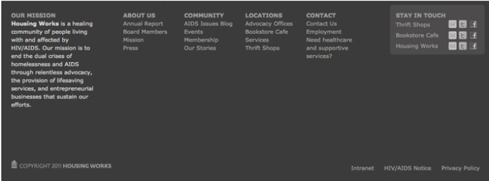
(2.2) Informational Footer

Make the footer useful and keep it simple. A minimalistic feel would do great for this aspect.

footer-housing

(3) Conversion

Screen Shot 2015-09-06 at 6.46.03 pm

This would probably require, in my opinion, the most important web design element — Call to Action. “A website without a call to action defeats its purpose.”

(3.1) Call to Action

Call to action prompts need to be obvious and strong. Techniques such as colour, contrast and space can help lead users to the “right” buttons.

Screen Shot 2015-09-06 at 6.52.42 pm

References: 

Carrie Cousins (2013). 10 Crucial Elements for Any Website Design.

http://designshack.net/articles/layouts/10-crucial-elements-for-any-website-design/

Fixx Digital (2014). Effective Web Design.

http://fixx.sg/effective-web-design/

Lim Hui Kai, Kiven

6 September 2015

Web Design Element

Here are some Design elements that would make a website unique and publishable.

1: Unique Font Type

Sites like Ubuntu has its own unique and recognizable font. This helps consumers to be able to immediately identify them from their competitors. It would also help the company to establish its own brand in the long run. When creating the fonts, it is important that they are easy for your visitors to read; because chances are, if your text are too complex, they are probably going to skip it.

Ubuntu

2:  Minimalistic look

A minimal design focuses on a website’s content. It allows visitors to get right to the point by putting emphasis on the content over other design features. A simple look also helps to generate a lot of white spaces which is the key feature to keep the attention where you want it. Complicated designs can sometimes cause the user to spend more time looking for the intended content in the ‘overloaded’ website and possibly missing out on them completely.

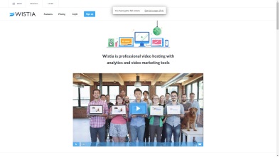
Websites like Wista uses a minimalistic look to help the user to focus on its content. A Simple design can also aid in making your website look clean and slick.

Wistia

3: Large, Responsive Images

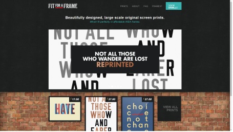
Displaying large product images and making them responsive makes for a good user experience. Large product images help to highlight the different features of the product in a more effective way and keeps the visitor thinking about the product with the visuals. Most people would skim through large amount of text, but with the large product images, they are more likely to get a better idea of the different product features.

Responsive images are important for viewers coming from different devices. They conform to any screen size whether you are viewing from mobile phones, tablet or desktop. This means you are able to view the full image clearly without scrolling up and down or left to right. Visitors can get the same experience no matter what device they are coming from and it is extremely important because more and more people are using mobile phones to find out information about different companies on the go.

Fit Fit2

4: Colour Scheme

Different colours communicate differently, thus when designing a website, it is crucial that the colours used are complementary to the product or services you are selling. For example, if you are selling children toys, you would most likely use a background colour that is soft or pastel to complement the bright and colourful toys (product images) on your website. This would not divert the attention of the viewers from the products you are selling.

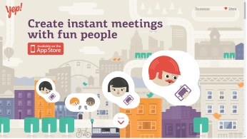
Contrast can also be the key to drawing attention. In website building, you would want the viewers to look at what you want them to; so for instance, a website which main theme is blue, an orange button would stand out and draws the user to it no matter in the middle of the page or at the side. This would be best applied to a call to action button, which is an entire element on its own. Therefore it is very important to carefully consider the colours used when building a website.

yep

Conclusion:

As more and more websites are pouring all over the place, it is essential to keep your design unique and user friendly. Information should be easily obtainable and never more then 2 – 3 clicks away. There are more then 10 design elements you can consider and pick from, these 4 are the ones that I think are critical when building a brand.

Thank you for reading.

Reference:

Sprung, R. (2014). The 7 Elements of Modern Web Design.

http://blog.hubspot.com/marketing/elements-of-modern-web-design-list

The Smashing Editorial (2011). Web Design Elements: Examples and Best Practices. 

http://www.smashingmagazine.com/web-design-essentials-examples-and-best-practices/

Chandler, M. (2014). 3 Necessary Elements of a Great Website Design. 

http://www.vieodesign.com/necessary-elements-great-website-design/

Basic Web Design Element : A Successful Button

The importance of headers, background and content of a website is known to all. The header which grounds all the individual pages as one allows a flow of consistency when a user navigates the pages. The background serves to create a visual interest and the content aims is the main idea the webpage sells to users. Yet unfortunately, an element that is often forgotten is the usually small, yet significant, button.

All designers strive to achieve an unambiguous and clear call to action on their web pages and good buttons allow that. A successful button brings the user to the true goal of the webpage. It plays with the psychology of humans which compels us to click on anything that seems prominent, and necessary. So how can a button be a successful one? 

#1 Familiarity
A button has to be like a friend to the user. The user should feel like they can understand the button and knows what to expect upon clicking it. Buttons with texts like “Home” and “About” are found in almost every website there is. This is because designers leverage on the familiarity users have with these texts (or even some icons) to allow users more ease and willingness to click on the buttons.

#2 Space
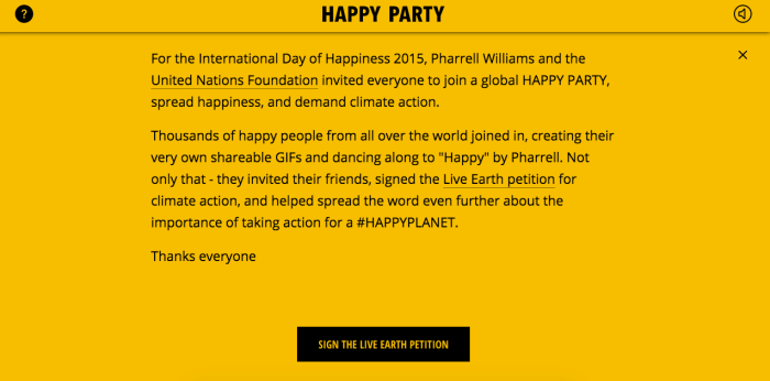
Whether it is above the fold, or below the fold, a button has to be placed in a manner which is obvious to the users. No matter where the button is, the use of white space will definitely help set the buttons away from the main content. The White and undistracted space steers them around the site.

http://madebyshape.co.uk/
https://www.globalhappyparty.com/about/

In the examples above, the white space around the buttons creates a focus for users, even if it is placed near the main content on the website.

#3 Directional Cues

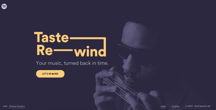
The goal in placing a button is to put it where the user is going to look next. It is possible to make use of directional cues from images or use the logical flow of content to predict this behaviour.

https://spotify-tasterewind.com/

In the above example,  the directional cue is pretty clear as the man in the background faces the direction of the main button, drawing the attention of users to the button effectively.

#4 Contrast
Contrast can be defined as “the difference in visual properties that makes an object (or its representation in an image) distinguishable from other objects and the background.” Hence, the more contrasting a button is, the more it will stand out in the webpage. Important buttons, such as Call-to-Action (CTA) buttons are usually the ones with the contrast. There are also many different ways to play with contrast such as colour contrast, size contrast and shape contrast.

( http://www.goldinteractive.ch/intro)

The button in the above example has a very contrasting colour to that of the background. This draws the immediate attention of the users.

Screen Shot 2015-09-02 at 10.29.36 pm
http://islandcreekoysters.com/ico/ – Use of shape contrast to distinguish buttons

The use of contrasting shapes is illustrated above where circular buttons are used amongst rectangular images and content. This distinguishes the buttons in the mess of content.

Conclusion
Apart from the factors mentioned above, there are possibly many other methods of making a button an effective one. What is clear is that buttons, especially CTA buttons, are an essential part of a website as it determines whether the goal of the website is accomplished. Take extra care in your buttons!

References
John O’Nolan (2010) Fully Understanding Contrast in Design
http://www.webdesignerdepot.com/2010/09/fully-understanding-contrast-in-design/

Jeremy Smith (2014) Secrets to Creating High-Converting CTA Buttons
http://blog.crazyegg.com/2014/10/16/high-converting-cta-buttons/

Dmitry Fadeyev (2009) 8 Characteristics Of Successful User Interfaces
http://usabilitypost.com/2009/04/15/8-characteristics-of-successful-user-interfaces/

Marc Schenker (2015) 4 Simple Ways to Design Killer Call to Action Buttons
http://www.webdesignerdepot.com/2015/03/4-simple-ways-to-design-killer-call-to-action-buttons/

Web Design Elements

Nowadays, every aspect of modern life is connected to the internet, and thus website has became the main marketing tools for many companies/organisations. However, besides products/services information, what other elements should be included in their web pages?

A great web design makes important content or desired actions obvious and appealing to the visitors. One of the effective websites that I found online is Whitehouse.

It has a clear page structure. Header, hero element, body and footer are the main skeleton of their website.

Whitehouse.gov Homepage

It has a consistent theme. Although most of the organisations prefer to have a more eye-catching homepage to other interior sub pages, it is important for us to maintain the overall website’s theme. In whitehouse.gov, their theme is focused, clear and obvious. The use of layout is very consistent in every sub pages.

Whitehouse.gov Subpage

It has a clean monochromatic design. Blue is the only colour used in this website. A right amount of white and black are being added to the base (blue) colour. The simplicity of this colour scheme and the peacefulness of the design make the site looks classy and elegant.

It has good typography. Studies have shown that serif fonts are easier to read in printed works and sans-serif are better on the web. In whitehouse.gov, font-family of Helvetica, Arial and Whitney SSm A (sans-serif typeface) are being used. Besides that, an appropriate amount of line-height, word spacing and margin/padding are used to improve the users readability.

It is easy to navigate. Their primary and secondary navigations have greatly improved the users experience in finding their way. All the links are grouped and organised in a clear manner, thus viewers can find their resources in just a few clicks. Besides that, there is always a “What are you looking for?” search box to help the users if they couldn’t find the information they want.

Whitehouse.gov navigation bar

It has hover effect that helps the visitors to keep track of where they are looking on a page. For example, when users hover to “Music & Arts Performances” link, the colour of the link changes from #6394c5 to #036 and the font is underlined. Furthermore, a title which serves as help words is also shown when we hover to each and every link.

Whitehouse.gov Hover Effect

It has images and videos. When we first view their home page, our attention will definitely be drawn at the giant image located at the hero element. On top of that, various small pictures and videos are being inserted into the website. Besides making the website more lively, many believe that a meaningful video/image leaves a greater impact than words.

Whitehouse.gov Video and Image

Data is organised neatly with read more button. Instead of showing the whole article, the website provides us the “read more” button, making the page looks less cluttered. In whitehouse.gov, flat buttons are used throughout the web pages. The use of flat button has avoided the excessive layering, and thus it fits the minimalist design theme well.

Whitehouse.gov Read More

The best homepages aren’t always static. Whitehouse.gov constantly changes its website to reflect the needs, problems, and questions of their visitors. The dynamic contents encourage the visitors to visit their website more often, and thus making the whole online system very successful.

Reference:

Whitehouse: https://www.whitehouse.gov/

Elements of modern web design: http://blog.hubspot.com/marketing/elements-of-modern-web-design-list

Choice of fonts: http://www.webdesignerdepot.com/2013/03/serif-vs-sans-the-final-battle/

Best website homepage design examples: http://blog.hubspot.com/blog/tabid/6307/bid/34006/15-Examples-of-Brilliant-Homepage-Design.aspx?__hstc=93759874.3ec21f8749c2d6404465186856fb8160.1441358935000.1441358935000.1441358935000.1&__hssc=93759874.1.1441358935000&__hsfp=3605072521

Web Design Elements

The key to design a good website is to fulfill and inbuilt the web design elements in accordance in which are details often missed by majorities. It is true that the design(the display) of a website is essential, however having the listed design elements below would be beneficial to a website page. Having good color theme to provide eye-catching and consistency through the website pages could also differentiate a outstanding webpage and a not so outstanding one.

Links

These are crucial portions of design which are often overlooked. Having different stages of state: Normal, Visited, Active and Hover.  Many websites have dark body copy against a light background, but the contrast is reversed in the footer. You need to plan for all of the various contexts of links found throughout the page.

01-links

Buttons

These are essential tools that is used on most websites for actions to be done, like for example, submitting forms. Having four stages too like: Default, Hover, Click  and Disabled. To provide a clear visual effect upon hovering, clicking and disabled are important to prevent any confusion from the user in not knowing which of the 4 stage he currently is in.

buttonpic

Page Stretch

A key aspect of design element would be how the website accommodate its content upon stretching and shrinking of the website. This is critical as the arrangement of the website contents like words or picture might end up in a mess upon re-sizing. Hence the layout should give allowance to re-sizing which would facilities easier usage  of website regardless of size.

The Basic HTML elements

The styles and elements of a website are the basics and not to be neglected. The standards elements to always plan for:  paragraphs, headings 1 to 6, un-ordered and ordered lists, tabular data, form fields, images, and bold and italicized text. A website essentials and by having a good organisation and consistency on these elements would result in a website.

headingsssss

Animations & Transitions

Animations and transitions are considered eye-catching if done well. It could result in a attractive state of art or annoying piece of image, hence going both ways. Some of the common places to build in would be on a home page banner, or having it as a tooltip. Example on the home page would be to have smooth transition of images every few seconds in a box or banner.

Forms

The appearance and layout of forms are extremely important in websites which requires them. It could facilitate easy maneuver or a headache to users who are less exposed to forms. The orientation of forms are to be neat and consistent, with the fonts used for each forms be similar. This serves like a conversation portal of the user and the website. The 2 important factors would be: Input fields and labels for forms. Input fields are supposed to be displayed on the form page which are styled and organised to the orientation of the website. Leaving empty fields could look weird and plain, but having default values could at least lead the user to their next step.

02-forms

In reality, the beauty of a website can be concluded as having good design, good orientation and consistency. Hence it makes web design elements as important or if not, more important than other aspect of a website.

References:

WebDesignerDepot 10 WebSite Design Elements           http://www.webdesignerdepot.com/2011/03/10-web-design-elements-that-you-shouldn%E2%80%99t-overlook/